UNA CITAZIONE LUNGA E COMPLICATA SULLA VITA E L’ARTE. QUALCOSA DI LUNGO E PROFUNDO CHE TI FARA DIRE “VALEVA LA PENA ASPETTARE DIECI MINUTI PER TRASCRIVERE UNA TRADUZIONE CHE” • AD ESSERE ONESTO, VOLEVO SOLO UN TESTO COMMOVENTE •
MOTION GRAPHICS
After modeling the shapes in Rhino 3D, I brought stills into After Effects to create these slow, floating shape animations used across ad campaigns and social media assets.
IDENTITY
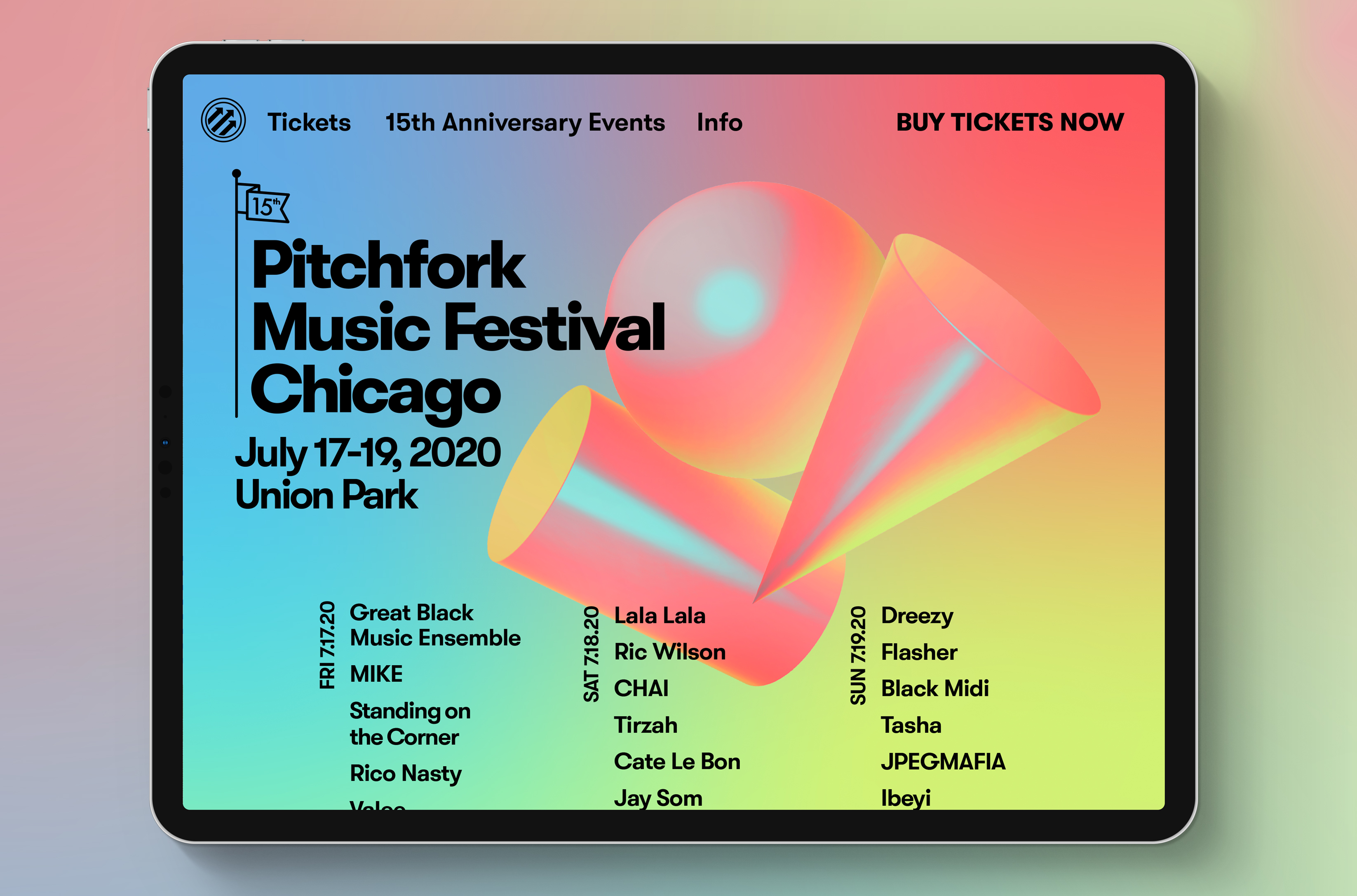
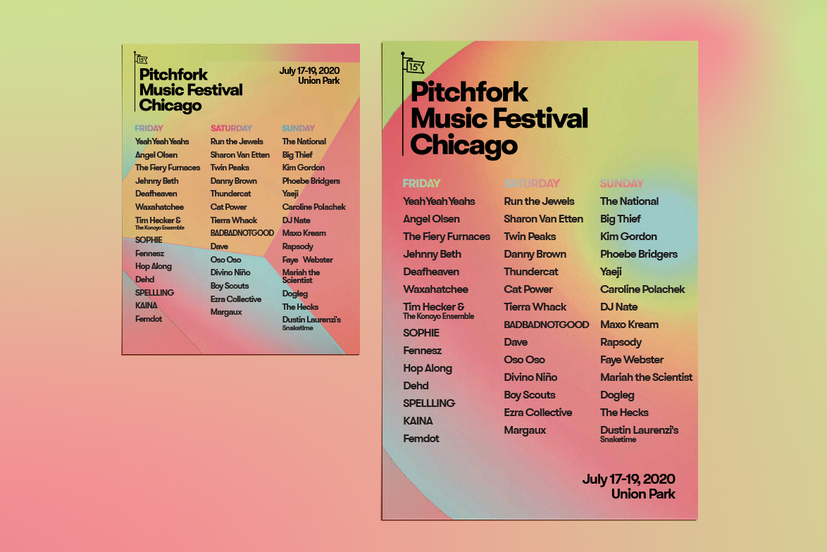
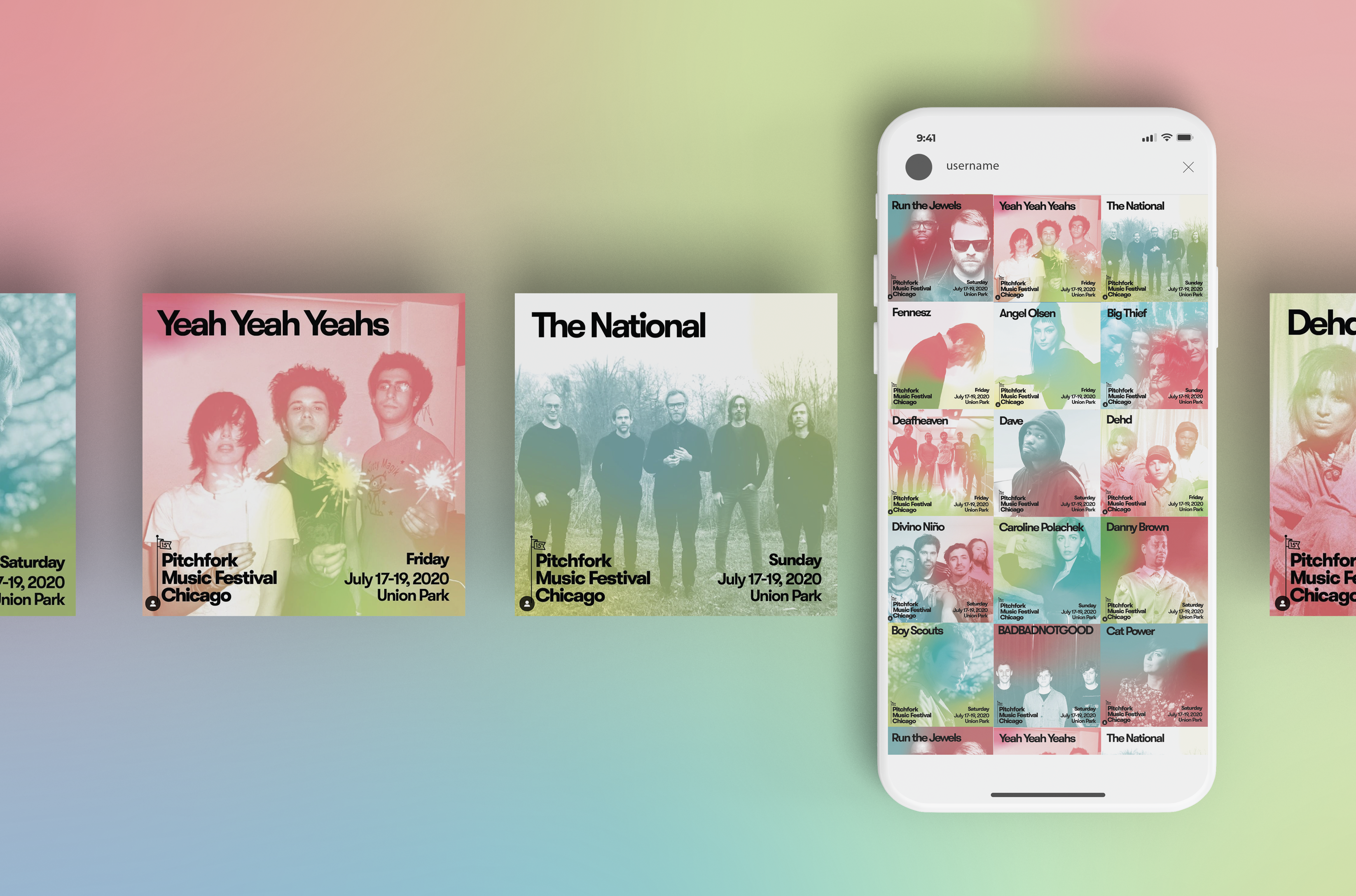
The identity for the 2020 Chicago Festival was intended to call attention to its 15th anniversary in the city it calls home.
Apart from pivoting away from the traditional red, green, & blue by focusing on a more vibrant pallet, we also created a 15th anniversary logo based on the flags that were part of Pitchfork’s previous aesthetic.
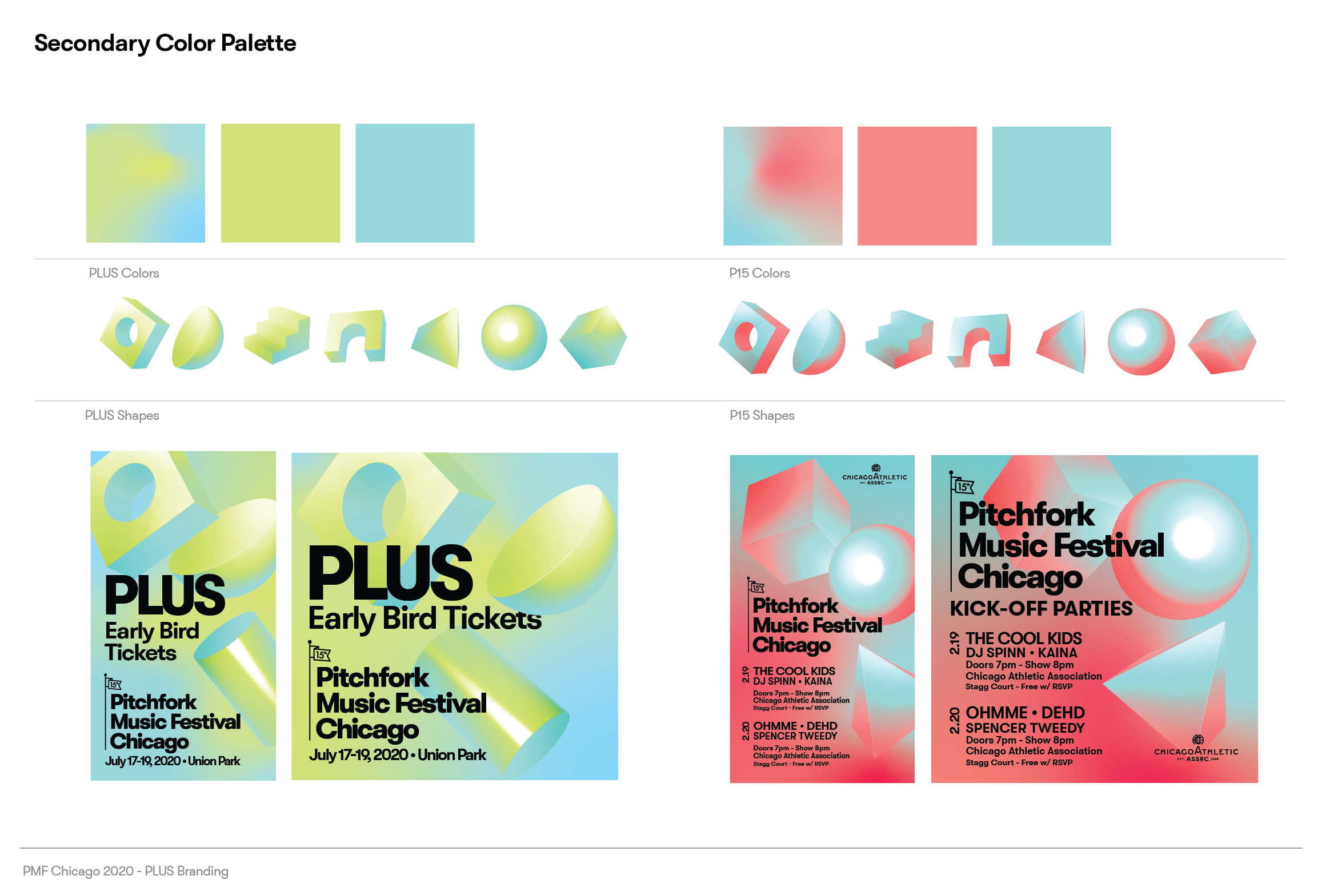
Graphic Design
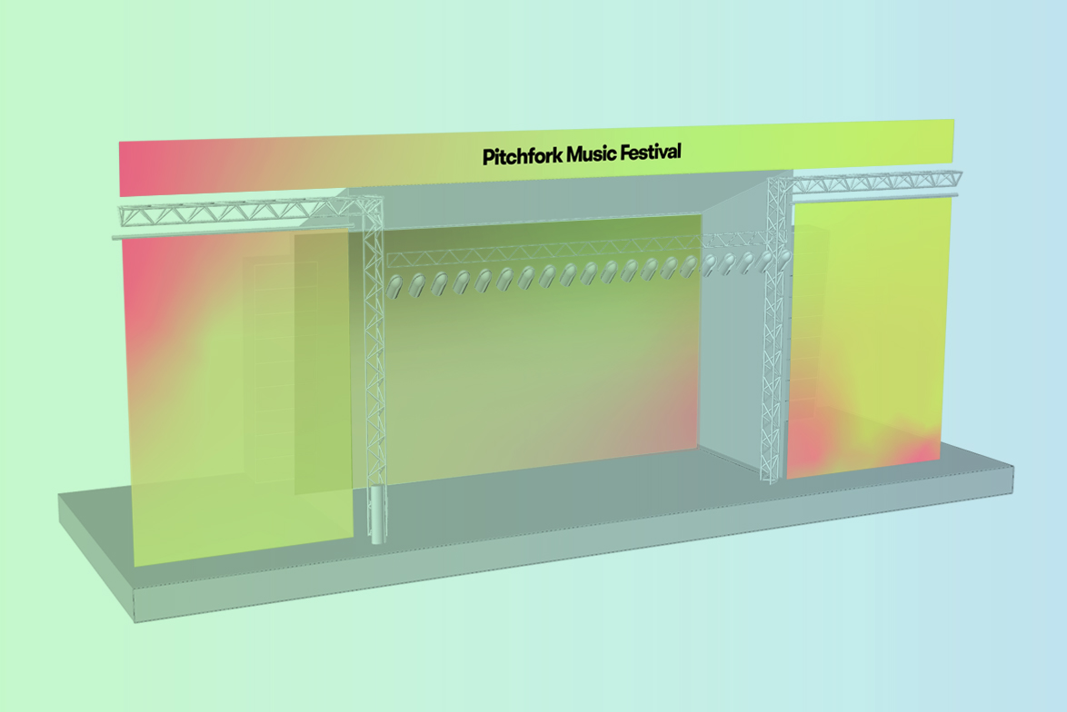
The dimensional shapes and cotton candy gradient were applied to everything from social media to the stages themselves.

ENVIRONMENTAL DESIGN
The 15th anniversary kick off party was designed around the idea of using elements from past festivals.
Held at at Stagg Court at Chicago Athletic Association, I designed the event around a CAD model I built of the court and peppering it with existing flags from the 2016 Festival.